Final Submission!
Posted: June 6, 2014 Filed under: Brandworld, Digital ME, Penguin Book Cover, Persuasion, Subject Leave a commentWow! The end of an era. Friday is our final submission and I decided to finish everything today. So I came here to make a special post summing up all the projects we did in Subject.  Brandworld:
 Persuasion: With not many adjustments to make besides some spelling mistakes, you can check out the final video here: Remembering the final solution:
- Create a short video (no longer than one minute) to tell about the charity and ask for voluteers and donations, leading people to look the organisation website;
- It would be shared on the internet and also could be displayed in the schools where the project is presented, to invite more children to participate;
- With the video, there would be facebook campaigns to also invite people to look at the website and watch the video;
- The idea is that, in the future, all the branding layouts would follow this drawing style, including the website, to unify the charity brand.


Final Exhibition
Posted: June 1, 2014 Filed under: Field, Random, Subject Leave a commentAfter a week preparing everything, we finally could see the year results on the exhibition Friday and Saturday. It was really nice to see all the work together, and how much progress everyone did!
Besides that, I was short listed for a interview with Brand Union (this massive global branding agency that had works even in Brazil!), and the interview was Friday before the exhibition.
I was really excited about it, because it could be an opportunity for me to extend my exchange here (after all, I only have 3 months left!), but I didn’t get it. The students that got it deserved! I was told that my work does not really match the company’s, which is true, since my main focus is in illustration and typography, and not much branding. It was an amazing opportunity, and I was really happy only for being short-listed. Maybe in a next time, right?
SpiderHeck
Posted: May 30, 2014 Filed under: Random Leave a commentToday the two-day event SpiderHeck finished, and I had a great experience!
In this event, there were four starting up business and we had to get in groups and help them to go further. My team was responsible for the EventRater, a website/app that gives the opportunity to people evaluate events and give the feedback to the managers and venues.
The app was still in the beginning of development, so we helped to make it more user friendly and think about different ways to attract the attendees to give their feedback.
We didn’t won the prize, but it was a great experience to realize how hard is to start a business, and how many things you have to think of. Great!
Stills – CV
Posted: May 27, 2014 Filed under: Digital ME, Subject Leave a commentToday we had a lecture from the branding agency Stills about CVs.
It was really nice to see how they select CVs, and find out that actually you only have 6 seconds to impress someone enough to choose your CV in the first selection. Hard huh?
But what I was really glad about was that Kyle Darlington, the Stills Business Development Manager, remembered my brand from the portfolio review I did with them in the end of second term. That means that my brand works, I guess, it calls the attention and stays in people’s minds.
Besides all, the workshop was really useful!
Digital ME
Posted: May 12, 2014 Filed under: Digital ME, Subject Leave a commentThese two last weeks have been really busy and unfortunately I didn’t have time to post about our last project in Subject: Digital ME. So I’ll condense everything in this big post.
Digital Me was all about who we are as designers and how we communicate ourselves to the world digitally. After the briefing section, we had a workshop to see the different ways we can put our portfolio online: from behance to flickr, what are the tools, how much it costs, how it will be displayed, everything. And there are a lot of options.
On thursday, we talked about how we can optimize photos to put in our portfolio, how we can create interactive pdfs and a little about how to behave in interviews and make yourself unique.
Then, we had a really nice lecture with Fran O’Hara, about being unique, finding out what we’re interested and what are our goals for the future. Made me think a lot about how I’m going to achieve my professional dreams, and made me more confident about it. It was a journey of self-awareness. I took some photos, but unfortunately I lost my phone and everything was in it 😦
Meanwhile, I was working on my CV, Online presence and a interactive pdf of my portfolio. A lot of work! I was trying to do something unique that would show my interests, mainly in typography and illustration. After some struggling, I came up with this final piece which I’m really proud of:
 Besides that, I updated my behance as online presence, and also created a interactive pdf that you can download here too > FlaviaMayer_PORTFOLIO
After the last tutorial, there are some adjustments to make: some corrections in the text and some layout details. But the overall is really good, and I’m really happy with it.
Fields – Reflective Journal and last results
Posted: May 8, 2014 Filed under: Field, Field 1 | Beyond Fiction, Field 2 | Real World Leave a commentAfter working this week on my Reflective Journal, I decided to make a last post to show how was the Beyond Fiction final work and some printed results from my placement at Bobalong:


You can check my reflective journal here: mayeramaral_flavia_st20048275_graphiccommunication
And here is a little conclusion about everything I experienced in Fields:
The second term was really interesting and important for my life as a student, as a designer, as a professional and as a person. I had learned so much, with many different and rewarding experiences that I will sure remember in the future.
Going back quickly into both projects, it is possible to perceive how they complete each other in terms of experience and knowledge acquired.
First, in Beyond Fiction, I had to work a lot with my imagination, figuring out a way to create and tell a story with random objects. The journey was hard working but enjoyable, where I learned especially to listen the others, look for new inspirations and also be more confident about my ideas and invest in them when I believe it is right.
Then, in Real World, I had to come back to reality and think about my attitudes professionally, at work, with clients, suppliers and co-workers. I could find out what path I want to take in the future as a designer, which areas I am more passionate about. The experiences I had, the tasks I was asked to do taught me more about design, relation with people and the profession.
In this way, these experiences, together, could help me develop a complete package of skills and knowledge, working on both creative and business sides. It was not only useful, but also gratifying to participate on these two projects, and they made me feel more certain of what I want and what I will dedicate myself in the future.
The only thing I wish was different was the time length, which, for me, was too short. I enjoyed so much both experiences that I wished I could have more time to dedicate myself into them – in this way I believe that I would have learned even more than I did.
Nevertheless, I feel that my choices of projects were certainly successful, satisfying, and made the second term one of my best experiences in this exchange year.
Last week of work :(
Posted: March 24, 2014 Filed under: Field, Field 2 | Real World Leave a commentLast friday was my last day of work. So sad!
But I have to tell it was a great experience, I’ve learned a lot and I’m very thankful to Malin for letting me work with her.
Here is a little bit of what I did in this last week:

One student is finishing her degree and she needed business cards to start her career. So I did some options for her.


Also, I’ve worked in a new folder for the Cardiff Steiner School, creating two options. The idea was to be something simple but engaging and interesting for parents to look.
This folder, together with the invitations, will still be printed so when I get the chance and have them printed with me I’ll take some pictures and post on the blog!
For now, I had to create a small presentation about my experience in real world, that you can see here > flaviamayer_presentationrealworld
I believe this was one of my best academic experiences so far on the exchange, where I had the opportunity to see how things go in the real world in areas that I really enjoy and want to work in the future. Working at Bobalong inspired me to continue investing on a design career and start thinking about my own business. Overall, an amazing month!
Constellation PDP
Posted: March 20, 2014 Filed under: Constellation, PDP Leave a commentWriting a pre-dissertation is not easy, specially when english is not your first language. It requires a lot of reading, researching and thinking.
The first challenge was to decide on a theme. Talking with tutors, I decided to work on something that I could develop when I come back to Brazil – since I’m only staying for one year, I won’t do my final dissertation here, although my university has a similar process and therefore I can continue the work I’m doing here.
One of my passions in Graphic Design are books. One of my passion hobbies is illustration. And one of my life passions is Classical Music. As I really enjoy creating drawings for children, I thought about uniting all these passions in one final artwork: a picture book about classical music.
In the beginning I was conflicted between creating a book or an app – since the last one is more fashionable nowadays. However, after discussing with the tutor, I got to the conclusion that the book would still be more useful, as in Brazil we do not have as much access to this kind of technology as here. The big aim of this project is to bring music to children that normally would not have access to it – and unfortunately they also usually don’t have access to tablets or smartphones.
Defined that, I started my research. On one of the first tutorials, the tutor indicated the book Visual Music: Synaesthesia in Art and Music Since 1900. It was very helpful as a starting point – it helped me understand better what several ways we can interpret music through visuality.
After that, I went to the Central Library in town to look for some books, and found a lot of interesting bibliography for children’s illustration. The book Illustrating Children’s Books: Creating Pictures for Publication gave me a real notion of how to create a picture book, from the first sketches to getting published. The examples really got me inspired to continue on this work.
But there was still something missing: I needed to understand how infants learn music, to eventually create not only the illustrations, but the book content. Using Summon, I could find several journal articles about musical picture books and a book that will be the theoretic basis to structure my final artwork: Music, Mind, and Education.
Meanwhile, we had a group tutorial, where we tried to identify who had similar projects to gather together and discuss in groups. My project was really the most different of all, and it didn’t actually fit in any group. But it was really interesting to see what other students are planning for their dissertations – so many interesting themes!
Reading all this books and articles was not an easy task, but I am glad that I did. Together with the tutorials, they gave me the basis to continue my work and go through the proposal. Besides that, they gave me a lot of new ideas for the artwork itself.
So, I opened the word document and started writing. I admit that I had to ask google translator, as the right words came in portuguese sometimes! But it went better than I expected. It took me a couple of weeks to put everything together, and with almost everything completed, I went to my last tutorial.
For my happiness, the tutor really liked what I wrote! Of course I was afraid, asking myself if I had done the right things and if my english was good enough. But these were really good news!
I only had three things to do: fix the title, fix the reviews and do some visuals. The title – An Illustrated Children’s Book About Classical Music – was too descriptive, so we got to the conclusion that it would be better if it was: “Synaesthesia, Music and Illustration: A Children’s Picture Book About Classical Music”.
The reviews were too much a summary of the books, and I had to analyze them more in relation to my dissertation themes and to each other. Done that, it was time to do some visual work. So, I researched similar books and illustration references. I even bought a really nice children’s book, called Listen to the Birds: An Introduction to Classical Music. And, to finally finish my work, I did my first ideas sketches.
It was a lot of work! But it was worth it. With this proposal as a basis, I will be able to develop my idea in Brazil and hopefully produce a successful final dissertation. There still a lot to research and to decide: the content of the book, style of illustration, suitable age etc. Anyhow, I feel very confident about it and I believe I am on the right way, thanks to the tutorials and the research I have done.
Doing some more work!
Posted: March 19, 2014 Filed under: Field, Field 2 | Real World Leave a commentThe second week of work was really productive, with a lot of new ideas and creations. I can believe this is the last week already!
Developing the invitations, we came up with four final ideas:
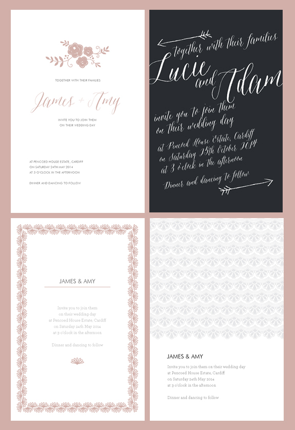 The first one inspired on flowers and embroideries.
The second one is supposed to be print in white ink. After a visit of the paper supplier, we got really excited with the new possibility of printing digitally in white. So I created this new invitation that will be printed in white on a dark paper.
The third and forth one are inspired in lace. The last one, the lace vectors would be printed on letterpress without ink, leaving just the deboss.
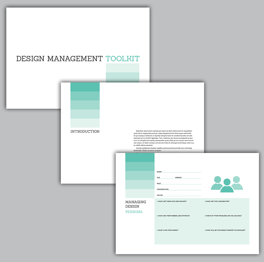
Besides the invitations, I created two layout options for the Design Management Toolkit, that will be produced by Design Wales. They were supposed to be simple but not boring, since they contain activities to people learn how to deal with design when creating a business. This were the results:

Also, I’ve been working on a new alphabet of monograms, to be printed on envelopes, papers and other stationary. After drawing, scanning and vetorizing them, this was the final result:

Some more questions about work!
Posted: March 17, 2014 Filed under: Field, Field 2 | Real World Leave a commentAnd, to tell more about my experience, here are some questions:
What have you learnt about yourself as you continue your placement in terms of skills, knowledge and about yourself?
I’ve learned that letterpress, invitations and typography are design areas that I really enjoy and identify myself to. Working with this, my skills are improving in this particular themes.
How do you feel about the most recent experiences and have these feelings impacted on your work at any time?
I feel great and excited to work.
Have you completed or contributed to any particular projects so far?
Yes, as I showed above.
In what ways are you now better prepared for each day in work?
I feel I am learning to make a better use of space, typography and graphic elements, doing dynamic but simple and minimalist things.
Can you identify areas where you would like to improve your skills, and how do you hope to do this over your final days on placement?
I think I’m already improving my skills in editorial, invitations and typography, so in continuing to do this work, I’ll develop them even more.

Recent Comments